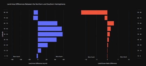
[OC] Land Area Differences Between the Northern and Southern Hemispheres
Like
Comment
Share

[OC] Land Area Differences Between the Northern and Southern Hemispheres


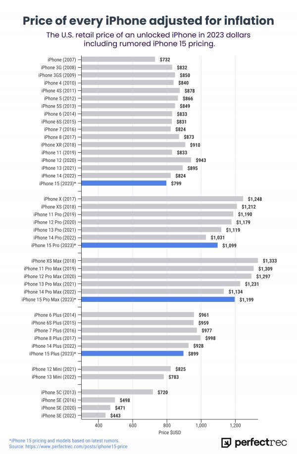
[OC] The price of every iPhone adjusted for inflation, including rumored iPhone 15 prices
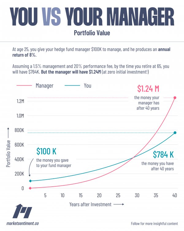
[OC] Long-term impact of fees in investing
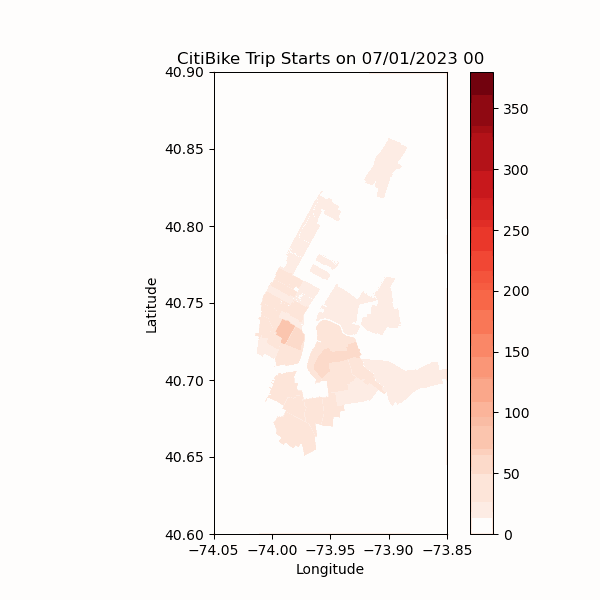
[OC] Number of CitiBike trip starts in each NYC zip code over Sat, July 1, 2023
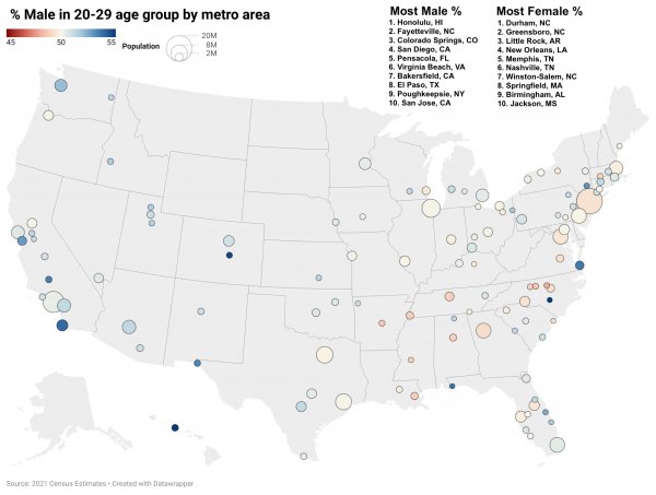
Which U.S. cities have a gender imbalance in 20-somethings? [OC]