DEAR UBER UI/UX DEVELOPERS: FIX THIS!!!!!!!
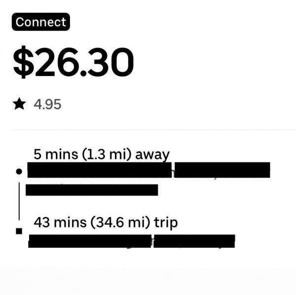
1- When I see an Uber Connect order, I can’t even preview it to see where it’s coming from or going to.
2- When I click it to see what it is, make it act like a regular order I can either decline or accept
3- Too many times a customer had selected an Uber Connect out of confusion, old age or just plain trying to get over. Give the customer a chance to Verify that they are NOT looking for a Ride somewhere
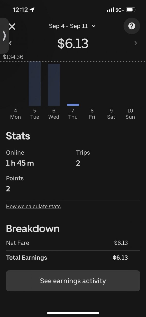
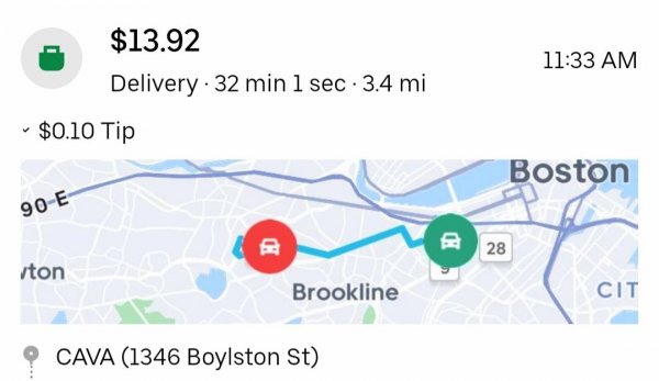
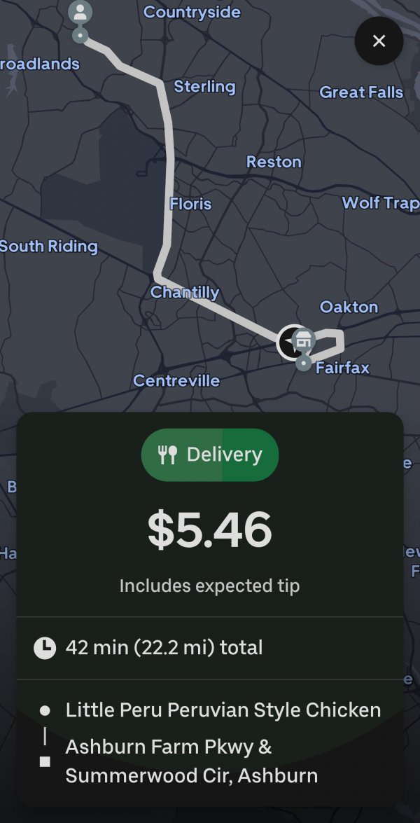
4- LET CUSTOMERS TIP BEFORE REQUESTING AN UBER CONNECT!!!! And let them tip whatever they want! Nobody’s driving that far for little to no money. If you let customers tip, more drivers would actually accept the order.
Uber Connect is a GREAT idea, it just needs to be managed better!
