HDR UI Elements in IOS17 Bèta
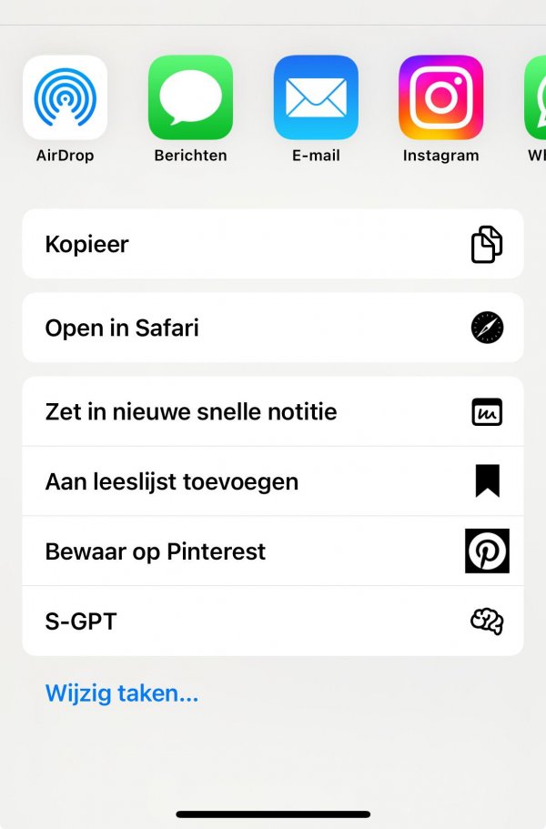
Since I updated my iPhone 14 Pro to iOS 17 beta, I have noticed that Apple has incorporated HDR elements into its user interface. This was particularly noticeable to me on the sharing page where the options appear brighter white in color compared to the rest of the interface. Knowing that screenshots are not captured in HDR, I took a screenshot of this page to verify my theory. Has anyone else made similar observations?


